Client
IKEA
Industry
Home Furnishing
Role
UX/UI Lead
Our challenge was to design a seamless experience that respected IKEA’s strict brand guidelines while still allowing Svea Solar to manage conversion and product details on our end.
No items found.

Discovery

  • IKEA’s strict brand rules meant we couldn’t show products or pricing on their domain.
  • Users dropped off after clicking “Go to Svea Solar” because the visual shift felt like leaving IKEA.
  • We couldn’t legally or technically embed Svea’s funnel within IKEA’s environment.
  • The partnership risked losing users at the most critical point of the purchase journey.

Process

  • Audited IKEA’s pages and heatmaps to understand user behavior and key drop-off points.
  • Created and A/B tested two versions of the form, experimenting with fonts, colors, and layout.
  • Noted that IKEA covered the awareness and decision stages, while Svea Solar handled conversion.
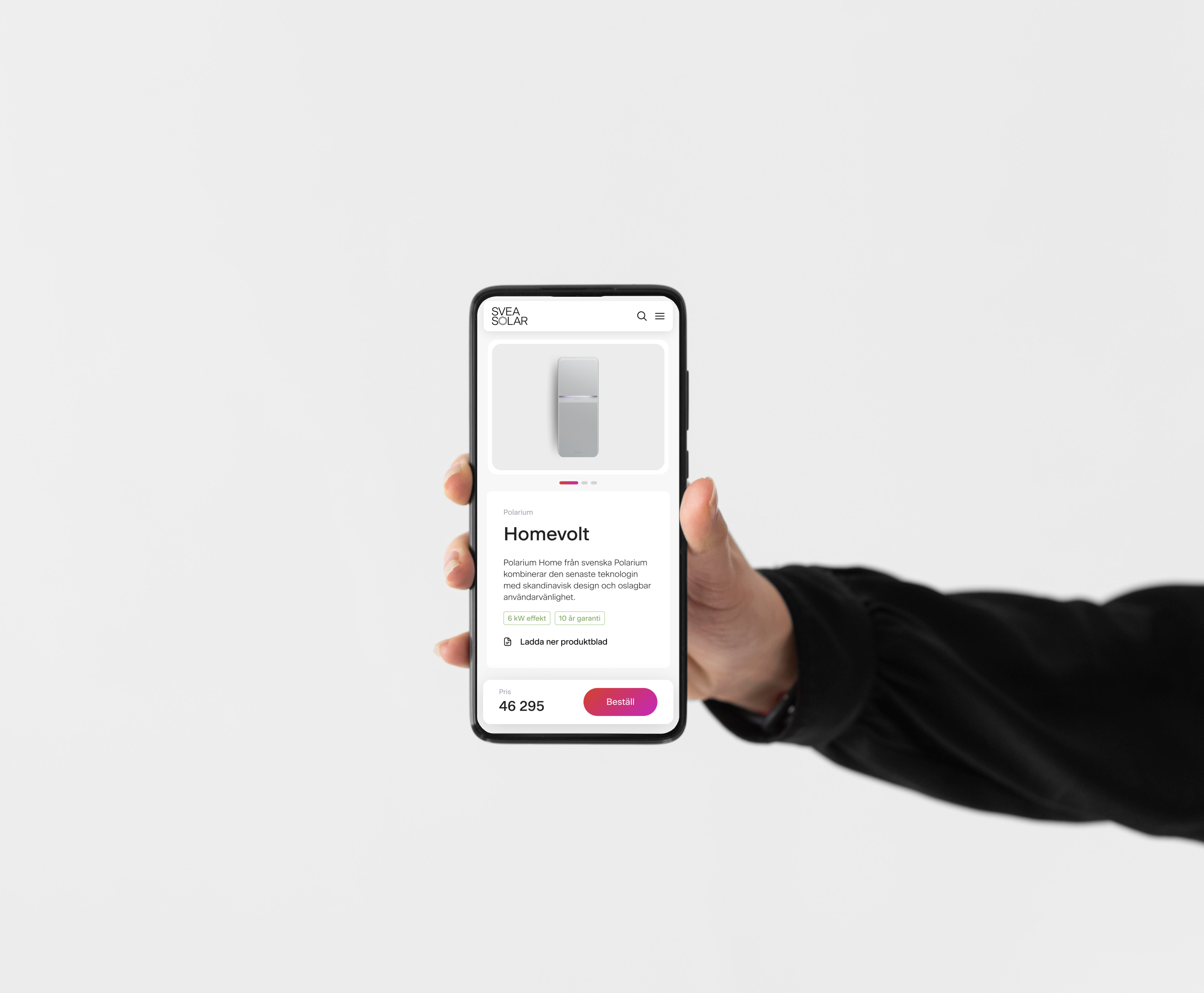
  • Discovered users were most interested in comparing product packages, so we moved that section up and built the funnel around it.

Toolkit
Figma, Adobe Creative Suite, Hotjar, Mixpanel, Salesforce
No items found.

Solution

  • Created a bridge experience: designed a landing page form on Svea Solar’s side that visually matched IKEA’s style without breaking guidelines.
  • Worked closely with IKEA’s content team to align copy, structure, and information hierarchy on both sides.
  • 3 persona entry points to gather information on user preference.
No items found.

Impact

  • Initial rollout showed a drop in conversion (users hesitating to fill the form).
  • Through ongoing A/B testing and visual alignment, we saw a steady improvement in trust and completion rates.
  • The updated funnel increased conversions by 12% and significantly reduced drop-offs after referral from IKEA.
  • This spiked interest in how we can move forward with this new type of collaboration.

Reflection

  • Learned how to design within strict brand constraints while maintaining conversion goals.
  • Saw how small visual details—like color shades and button states—can build user trust and continuity.
  • Balanced brand partnership requirements with clear, effective UX design.
  • Proved that thoughtful visual alignment can create measurable impact even with limited flexibility.
Additional work
Svea Solar - Ecom
Arrow pointing right icon
Web UX
UI Design
Sherlock Investigates
Arrow pointing right icon
Product Design
Back Office
Arrow pointing right icon
Platform Design
Horizon Capital
Arrow pointing right icon
App UX
UI Design
Want to work together?
Let’s bring your projects to life
Get in touch
Get in touch
Graphic design